Widgets
Widgets are functional components designed to perform specific tasks. They consist of various block types that help construct UI elements, respond to events, invoke functions, or update the interface. Blocks within Widgets are grouped by component and distinguished by color according to their type.
Timer
The timer is used to generate periodic timer events, which can be handled to execute defined code.
timer control

timer control is an HTML control block that appears in the interface as an HTML group element:
The ID attribute is a unique identifier for the UI element and the specific timer object. Blocks interacting with the timer use this ID to reference it.
The control has built-in timer settings and start/stop functions and maintains timer status indication. When the user clicks the Setup button, a dialog to set the timer interval opens:
The trigger interval is in seconds, with a minimum value of 0.1 and an increment of 0.1. Settings are stored in the browser's local storage.
Click the Start/Stop button to toggle the timer's start/stop state. When the timer starts, it generates timer events at the set interval, triggering the corresponding event blocks to execute.
Applying the CSS class hidden hides the control. In this case, the control's operations (setup, start/stop) can be performed using the corresponding function blocks. This is suitable for timers controlled by the program without user interaction.
Attributes
- ID - The timer's ID.
timer set interval

timer set interval sets the timer's trigger interval in the program. The interval can be set by the UI control (user setting) or by the timer set interval block in the program (developer setting).
Attributes
- ID - The timer's ID.
- interval - Timer trigger interval (seconds). Minimum value
0.1, increment0.1.
timer switch

timer switch is used to control the timer's start or stop in the program.
Attributes
- ID - The timer's ID.
- switch - Start/stop action:
start- Start the timer.stop- Stop the timer.
when timer triggers

when timer triggers handles the timer events. When a timer with the specified ID triggers an event, the program jumps to the corresponding when timer triggers block to start execution.
Attributes
- ID - The timer's ID.
Charts
Chart widgets visually represent dynamic data and are commonly used in IoT dashboards. These widgets include line charts and gauges. When added to the workspace, charts appear as placeholder blocks in the preview area. Once the script is loaded via the button in the script bar or after the project is published, the charts populate with data and display according to the script logic.
Online examples: Line-Chart, Gauge.
line chart

A line chart displays dynamic sequence data, with the horizontal axis representing time and the vertical axis representing values. Each line of data in a line chart is called a series and can be updated while the program is running.

The line chart's height needs to be set, while its width is adaptive. Typically, you set the height using a size style block:

The ID attribute is a unique identifier for the UI element and the specific line chart object. Blocks interacting with the line chart use this ID to reference it.
Clicking the settings icon opens the line chart settings dialog:
Settings
- Title - The title of the line chart and its position (Left
L, CenterC, RightR). - Legend - Legend direction (
HorizontalorVertical) and its position (LeftL, CenterC, RightR). - Data Size - The maximum number of data points displayed for each series. When new data is added beyond this limit, the oldest data is removed, causing the line to shift left.
- X Interval - The minimum interval (in seconds) between scale lines on the X-axis (time axis), used to control the density of the X-axis scale.
- X Split Line - Show the X-axis scale line.
- Y Split Line - Show the Y-axis scale line.
- Border - Show the default border (the border can be customized with style blocks).
line chart push

line chart push sets data for a line chart series. Each line in a line chart represents a series, identified by the specified name. line chart push adds a new data point to the specified series, including the time (X-axis) and the corresponding value (Y-axis). The data can be a numeric value, in which case the current time is used as the data's timestamp, or it can be specified using the line chart data block with a specific time and value.
Attributes
- ID - The line chart's ID.
- series - Series name.
- data - The data to be set, which can be a numeric value or data represented by the line chart data block.
Examples
Numeric data (25).

line chart data data ('2024-06-18 21:31:09', 25).

line chart data

line chart data packages time and value for a line chart series and serves as the data parameter for the line chart push block.
Parameters
- date - Supports the following types of time representation:
- String time. For example,
'2024-06-18 21:31:09','2024-06-18 21:31','2024-06-18'. - UTC timestamp (milliseconds since January 1, 1970, 00:00:00 UTC). For example, the UTC timestamp for
'2024-06-18 21:31:09'in the East 8 District is1718713869000. - JavaScript Date type variable.
- String time. For example,
- value - Numeric value.
Examples
String time representation.

UTC timestamp representation.

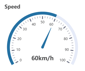
gauge

gauge is an analog pointer meter commonly used to display single-dimensional real-time data, such as temperature, humidity, speed, etc.
The gauge's height needs to be set, while its width is adaptive. Typically, you set the height using a size style block:

The ID attribute is a unique identifier for the UI element and the specific gauge object. Blocks interacting with the gauge use this ID to reference it.
Clicking the settings icon opens the gauge settings dialog:
Settings
- Title - The title of the gauge and its position (Left
L, CenterC, RightR). - Axis Width - The width of the arc axis.
- Axis Color - The color of the axis or color segments.
- A single HEX color value specifies the overall color of the axis. For example,
#EBEBEB. - Color segments divide the axis into sections of different colors, conveying additional meanings of the data. Segments are separated by
|, with each segment consisting of an end position ratio (0 to 1) and a HEX color, separated by,. For example:0.4, #E88C30 | 0.7, #8CBD28 | 1, #288CBD.
- A single HEX color value specifies the overall color of the axis. For example,
- Angle Start - The starting angle of the axis, defined in terms of polar coordinates.
- Angle End - The ending angle of the axis,defined in terms of polar coordinates.
- Value Min - The minimum data value (the scale value corresponding to Angle Start).
- Value Max - The maximum data value (the scale value corresponding to Angle End).
- Pointer/Color - Displays the pointer and its color. The progress bar shares the same color as the pointer. When the axis is segmented with colors, the pointer color dynamically adjusts to match the segment corresponding to the data value.
- Markers - Show the scale lines.
- Labels - Show the scale values.
- Markers Number - The number of scale divisions and their position (
InnerorOuterside of the axis). - Value Font Size - The font size of the data value.
- Suffix - The suffix of the data value (unit).
- Value Offset X/Y - The X/Y offset of the data value relative to the center of the gauge (percentage of the gauge radius).
- Border - Show the default border (the border can be customized with style blocks).
gauge set

gauge set sets the gauge value. The numeric value connects to the right-side input socket.
Attributes
- ID - The gauge's ID.
Example
Numeric value (100).

variable (Data).

Components
Components are encapsulated DOM controls, commonly used to build control panels, such as toggle switches, sliders, and joysticks. They also include predefined HTML container blocks for convenient panel layout.
component set state

component set state enables or disables a component, applicable to all components with toggleable states. Components have a more complex structure than standard DOM controls. component set state is the component implementation of control set state for the corresponding DOM category. Similar to setting DOM controls, the input socket on the right connects to a boolean value true for the enabled state, and false for the disabled state.
Attributes
- ID - The component's ID.
switch

switch is an HTML control block that appears as a toggle switch in the interface.
Toggling the switch in the UI triggers the corresponding switch (on/off) event. The switch event can be handled to execute defined code. The switch is similar to the checkbox (when the switch attribute is checked) in the HTML category. The difference is that the switch has a more suitable appearance and event definitions for panel applications, while checkbox is better suited for forms requiring custom values.
The ID attribute is a unique identifier for the UI element and the specific switch. Blocks interacting with the switch use this ID to reference it.
Clicking the settings icon opens the switch settings dialog:
Settings
- Label - The label of the switch and its position (Left
L, TopT, RightR, BottomB). - Size - The size (height) of the switch.
- Color - The color of the switch.
- ON/OFF Indicator - Shows the ON/OFF indicator.
switch check

switch check checks the current state of the switch and returns a boolean value indicating whether the switch is in the specified ON or OFF state.
Attributes
- ID - The switch's ID.
- is - Check if the switch is:
on- In the ON state.off- In the OFF state.
switch set

switch set is used to set the switch to the ON or OFF state.
Note: Setting the ON/OFF state does not trigger the corresponding on/off events. These events are only triggered by interface operations.
Attributes
- ID - The switch's ID.
- set - The ON/OFF state to be set:
on- ON state.off- OFF state.
when switch turns

when switch turns handles the switch events. When a switch with the specified ID triggers an on/off event, the program jumps to the corresponding when switch turns block to start execution.
Attributes
- ID - The switch's ID.
- turns - The on/off event to respond to:
on- Switched to ON state.off- Switched to OFF state.
toggle button

toggle button is an HTML control block that appears as a button with switchable ON/OFF states in the interface. The button needs to load script before it can respond to user actions.
The toggle button functions similarly to the switch, with the main difference being its appearance. Changing the button's ON/OFF state triggers the corresponding on/off event, which can be handled to execute defined code.
The ID attribute is a unique identifier for the UI element and the specific toggle button. Blocks interacting with the toggle button use this ID to reference it.
Clicking the settings icon opens the toggle button settings dialog:
Settings
- Label - The label of the button and its position (Left
L, TopT, RightR, BottomB). - ON State - The icon, text, and color displayed when the button is in the ON state.
- OFF State - The icon, text, and color displayed when the button is in the OFF state.
- Button Classes - CSS classes applied to the button, e.g.,
btn-sm(small button),btn-cube(equal padding button).
toggle button check

toggle button check checks the current state of the toggle button and returns a boolean value indicating whether the button is in the specified ON or OFF state.
Attributes
- ID - The toggle button's ID.
- is - Check if the button is:
on- In the ON state.off- In the OFF state.
toggle button set

toggle button set sets the toggle button to the ON or OFF state.
Note: Setting the ON/OFF state does not trigger the corresponding on/off events. These events are only triggered by interface operations.
Attributes
- ID - The toggle button's ID.
- set - The ON/OFF state to be set:
on- ON state.off- OFF state.
when toggle button switches

when toggle button switches handles the toggle button events. When a toggle button with the specified ID triggers an on/off event, the program jumps to the corresponding when toggle button switches block to start execution.
Attributes
- ID - The toggle button's ID.
- switches - The on/off event to handle:
on- Switched to ON state.off- Switched to OFF state.
slider

slider is an HTML control block that appears as a horizontal or vertical slider in the interface. The slider needs to load script before it can respond to user actions.
Dragging the slider triggers a value change event, which can be handled to execute defined code. The slider functions similarly to range in the HTML category, but with a more suitable appearance for panel applications, whereas range is better suited for form applications.
The ID attribute is a unique identifier for the UI element and the specific slider object. Blocks interacting with the slider use this ID to reference it.
Clicking the settings icon opens the slider settings dialog:
Settings
- Orient - The orientation of the slider track:
Horizontal- Horizontal slider.Vertical- Vertical slider.
- Min - Minimum value (can be negative or decimal).
- Max - Maximum value (can be negative or decimal).
- Step - Step interval (can only be an integer).
- Color - The color of the slider.
- Track Length - The track length of the slider (
0for default). - Range Labels - Show the minimum/maximum values.
- Value Pin - Show the current slider value.
- Continuous Trigger - Check to make the slider continuously trigger the change event when dragging; otherwise, the slider only triggers the change event once when the mouse is released.
slider get value

slider get value retrieves the current value of the slider. The return value is numeric.
Attributes
- ID - The slider's ID.
slider set value

slider set value sets the value of the slider. The numeric value connects to the right-side input socket.
Note: Setting the slider value does not trigger the change event. This event is only triggered by interface operations.
Attributes
- ID - The slider's ID.
when slider changes

when slider changes handles the slider's change event. When the slider with the specified ID triggers the event, the program jumps to the corresponding when slider changes block to start execution.
Attributes
- ID - The slider's ID.
joystick

joystick is an HTML control block that appears as a circular analog joystick in the interface. You control the joystick by dragging the center circle. The joystick needs to load script before it can respond to user actions.
Dragging the joystick's center circle triggers a change event, which can be handled to execute defined code. The joystick supports multiple drive modes, and the change event passes parameters (arg1 and arg2) based on the selected mode. By configuring the drive mode, you can match the joystick parameters to common projects and normalize values to a specified range.
Dual-Wheels - Suitable for cars (tracked vehicles) controlled by left and right wheels. Event parameters:
arg1- Left wheel load, positive/negative values indicate forward/reverse, with the range defined by the setting item (Normalized Range).arg2- Right wheel load, positive/negative values indicate forward/reverse, with the range defined by the setting item (Normalized Range).
Steering & Drive - Suitable for cars controlled by a steering mechanism and a drive. Event parameters:
arg1- Steering magnitude. 0 means straight ahead, positive values turn right, negative values turn left, with the range defined by the setting item (Normalized Range).arg2- Drive wheel load, positive/negative values indicate forward/reverse, with the range defined by the setting item (Normalized Range).
Angle & Distance - Outputs the angle and distance of the center circle from the origin, without normalization. Event parameters:
arg1- Angle value in degrees, rounded to one decimal place. 0° is to the right; angles increase clockwise (0° to 180° below, 0° to -180° above).arg2- Distance value, 0 or a positive integer. The maximum value is defined by the outer circle radius (Radius).
X & Y - Outputs the X and Y coordinates of the center circle from the origin, without normalization. Event parameters:
arg1- X value, 0 at the origin. Positive to the right, the maximum value is defined by the outer circle radius (Radius).arg2- Y value, 0 at the origin. Positive above, the maximum value is defined by the outer circle radius (Radius).
The ID attribute is a unique identifier for the UI element and the specific joystick object. Blocks interacting with the joystick use this ID to reference it.
Clicking the settings icon opens the joystick settings dialog:
Settings
- Radius - The outer circle radius of the joystick, which is the maximum distance the center circle can move (in pixels).
- Color - The color of the joystick.
- Drive Mode - See Drive mode.
- Normalized Range - The normalized range of output values. Applied to
Dual-WheelsandSteering & Drivemodes.
when joystick changes

when joystick changes handles the joystick's change event. When a joystick with the specified ID triggers a change event, the program jumps to the corresponding when joystick changes block to start execution. The event passes two parameters, arg1 and arg2, with customizable variable names for storing them. For parameter descriptions, see the Drive Mode section of joystick.
Attributes
- ID - The joystick's ID.
- arg1@ - The variable name to store the first parameter (default:
Arg1). - arg2@ - The variable name to store the second parameter (default:
Arg2).
d-pad

d-pad is an HTML control block that appears as a combined directional pad (D-pad) in the interface.
You can also create a D-pad using HTML button and group blocks with custom styles. The d-pad makes it easier to handle button events and keeps your layout simple.
Clicking any button on the D-pad will trigger a change event, which can be handled to execute defined code. The event parameter (direction) indicates the direction of the click.
The ID attribute is a unique identifier for the UI element and the specific D-pad object. Blocks interacting with the D-pad use this ID to reference it.
Clicking the settings icon opens the D-pad settings dialog:
Settings
- Color - The color of the buttons.
- Buttons Margin Y - The vertical space between buttons (size index:
0~5). - Buttons Margin X - The horizontal space between buttons (size index:
0~5).
d-pad set state

d-pad set state enables or disables the D-pad. Unlike the general component set state block, d-pad set state allows setting buttons in a specified direction. The input socket on the right connects to a boolean value true for the enabled state, and false for the disabled state.
Attributes
- ID - The D-pad's ID.
- direction - The direction to be set:
all- All directions (all buttons).x- Horizontal direction (left and right buttons).y- Vertical direction (up and down buttons).
d-pad event

d-pad event is used to handle events triggered by the D-pad. You can specify the event type (click, press, release). When the specified event is triggered, the program will jump to the corresponding d-pad event block to start execution. The event parameter (direction) indicates the direction that triggered the event.
Attributes
- ID - The D-pad's ID.
- event - The event type to handle:
click- Button click.press- Button press.release- Button release.
- direction@ - The variable name to store the event direction parameter (default:
Direction). Direction values:up- Up button triggered.down- Down button triggered.left- Left button triggered.right- Right button triggered.
indicator

indicator is an HTML control block that appears as a simulated LED indicator in the interface. The indicator set block sets the indicator to display or blink a specified color.
The ID attribute is a unique identifier for the UI element and the specific indicator. Blocks interacting with the indicator use this ID to reference it.
Clicking the settings icon opens the indicator settings dialog:
Settings
- Label - The label of the indicator and its position (Left
L, TopT, RightR, BottomB). - Width - The width of the indicator.
- Height - The height of the indicator.
- Radius - The corner radius of the indicator.
- Idle Color - The color of the indicator in the idle state.
- Blinking Interval - The blinking interval of the indicator (in milliseconds).
To make a circular indicator with a diameter of 10:
Width:10, Height:10, Radius:5。
indicator set

indicator set sets the indicator to display a specified color, or to blink a specified color. When is selected, the indicator displays its idle color.
属性
- ID - The indicator's ID.
- action - The action to perform:
set- Set to the specified color.blink- Blink the specified color.
- color - The specified color.
fullscreen button

fullscreen button is an HTML button that provides the fullscreen toggle function. The button needs to load script before it can respond to user actions.
Attributes
- ID - The unique identifier of the element. After setting this ID, the button can toggle between enabled/disabled states using component set state or have its style controlled by DOM scripts.
- color - The color of the button.
card

card is an HTML container used to group controls for display. Similar card containers can also be created using the HTML group block with custom styles. card offers a pre-set, unified container style, providing better consistency and ease of use. Simply add the controls to be grouped within the card container and set the layout parameters.
Clicking the settings icon opens the card layout settings dialog:
Settings
- Title - The title of the card and its position (left
L, centerC, rightR). - Padding X/Y - Horizontal and vertical inner padding.
- Items Orient - Arrangement direction of the internal elements (
HorizontalorVertical). - Main Axis Alignment - Alignment of internal elements along the main axis. See flex alignt.
- Cross Axis Alignment - Alignment of internal elements along the cross axis. See flex alignt.
- Items Gap - Spacing between internal elements (size index:
0~5). - Border - Show the default border (the border can be customized by style blocks).
Attributes
- ID - The unique identifier of the element. After setting this ID, DOM scripts can style the card.
Example

The example shows a card with the title Workshop. The child elements are arranged vertically (Vertical), aligned to the end on the cross axis (End), and have a spacing of 3. The card contains two switch controls labeled Light and Fan.